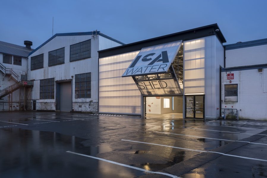


This summer, the ICA debuted a new visual identity conceived and carried out by award-winning designer Abbott Miller and his team at the international design consultancy Pentagram. Timed to the opening of the new ICA Watershed, the new identity strives to communicate ideas of openness, accessibility, and radical welcome embedded in both the new space and the institution’s strategic plan released in 2016.
From founding the multidisciplinary studio Design/Writing/Research to working with museum and corporate clients there and through Pentagram, where he is a partner, to extensive writing and publication projects, Miller has long used design as a way of exploring and interpreting art, architecture, public space, performance, fashion, and design. This deep and varied experience makes him uniquely suited to take on this important reimagining of the ICA’s public face.
At Design/Writing/Research, Miller pioneered the concept of “designer as author,” and he has written extensively about design, including in the 2014 monograph Abbott Miller: Design and Content. Learn more about his celebrated, wide-ranging work there or at pentagram.com.
Miller spoke with the ICA about the aims for the new ICA identity, the particular challenges of museum visual identities, and why he “hates” logos.
In your 2014 book Design and Content you wrote, “I hate logos. …[E]veryone gets obsessed with the logo when they should really be more concerned with how it’s used.” What is the role of design and a logo identity in giving voice to an art institution?
There are a couple of things embedded in that “I hate logos” rant. A “logo” is often invested with both too much importance and too little real estate. There is often a pressure on this graphic mark to try to sum up everything an organization stands for, when in fact it’s part of an ensemble of elements: words, typography, imagery, color, not to mention all of the actual services, things, and people that are represented by that mark. It has an outsized importance because it sometimes has to travel in isolation of all those other elements and still be memorable and meaningful and convey something about the organization.
You’ve worked with a wide range of ICA staff and constituents in the course of this project. Can you describe how you kick off a project like this?
The process involved the staff and the board: we met over several meetings to define the aspirations of the ICA and what makes the ICA unique, and to understand its role in the lives of its audiences. We had a couple of brainstorming sessions that helped us understand the spirit and tone of the ICA, and we did a full audit of the communications from previous years. That helped to define what the new identity needed to achieve.
What were your aims for the ICA logo and its context?
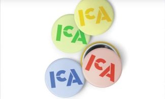
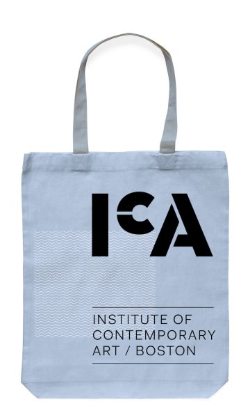
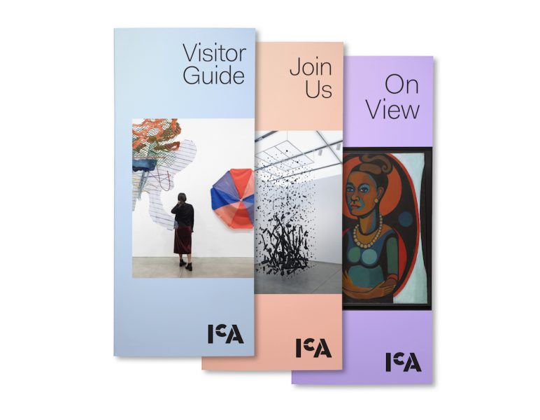
Our goal was for the mark to effectively tether itself in people’s minds to the spirit of the ICA and, over time, for it to function metonymically for the whole of the ICA. There are several other contemporary art museums with the acronym ICA (Boston was the first in the United States to be so named), so we also had to consider our visual expression in relation not just to other art museums, but to art museums with the same set of letters! This led us to focus on the typographic expression, and to look for a strong gestalt in the ensemble of the letters.
You’ve worked with museums including the Guggenheim, the Barnes Foundation, the Art Institute of Chicago, and the Sigmund Freud Museum, as well as commercial clients like American Express and Harley Davidson. How is designing or branding for an art institution is different from the commercial realm?
Corporate emblems like the American Express blue box or the Harley-Davidson logo have some advantages in having been around for many decades, and having deep exposure in different markets all over the world. Very few art museums can claim so much constancy in their visual expression. One of the founding designers of Pentagram, Alan Fletcher, designed the V&A logo in 1989 and it still looks as good as ever, but that is a real exception. There is generally higher turnover in the world of cultural institutions. That could be because they don’t have the opportunity to become as deeply entrenched as corporate marks.
There is a major difference in designing for cultural organizations because, with fewer resources and platforms, they have to use every opportunity to speak clearly and effectively to their audiences and they need to establish a tone of voice and personality. The visual quotient is especially high with art museums: much of what we design is really about creating a frame that interacts well with the art that gets put inside of it. Art “brands” and corporate brands need to function well and be consistent, but in the cultural sector you also need to watch out for things feeling overly branded.
One of the ICA’s aims is to keep artwork at the forefront of its materials, without letting them get too stark. How do you create design that is clean and elegant but still inviting?
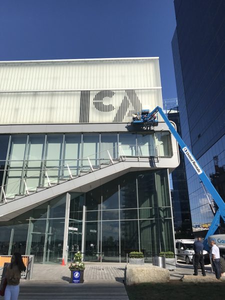
We needed an expression for the ICA that was declarative but still inviting, contemporary, and accessible. I think the visual identity we’ve developed allows for the ICA to have more prominence in its messaging about exhibitions: with fewer opportunities to get the word out there, it’s critical for the “authorship” of the ICA to be understood and appreciated. There is a graphic impact and scalability to the mark that allows for it to be a small emblem on a badge or as big as a single floor of the building. I think that range is due to the form being comprised of separate elements that coalesce.
Institutional identity projects are, by definition, institution-centric. And yet, when an organization chooses to work with a designer, they’re choosing their point of view. How do you balance your own vision with that of the client?
It might be a traditional metaphor, but it’s sort of like portraiture: you can see the sensibility of the painter or photographer in the finished piece, but the portrait has to ultimately convey the personality of the subject. There should be some initial affinity between the organization and the designer, but the goal is to give an expression to the place that feels true to the personality of the client and gives them a visual language for all of their needs.
Learn more about the thinking and work behind the ICA’s new identity in the video below.