Lucy McKenzie (Born 1977 in Glasgow, Scotland) is a fiercely experimental artist, a catalyst in her native Glasgow art community, and a deeply perceptive writer on the work of her peers. Like Andy Warhol or Martin Kippenberger, McKenzie has a profoundly self-conscious sensibility, one that is rigorously engaged with her world on all fronts. Trained in the commercial techniques of decorative painting, she slyly recalibrates the legacies, both aesthetic and social, of abstract painting, investigating technique and proposing new attendant meanings.

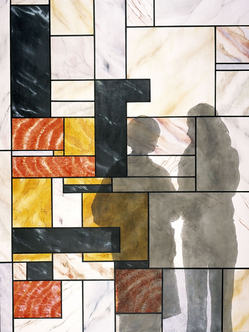
Often layering her work with cultural signification, double appearances, and euphemism, McKenzie is noted for pastiching historical design styles to extract their latent meanings—from the woodsy proto-modernism of Charles Rennie Mackintosh to socialist realist posters to the graffiti and New Wave fonts of the 1980s. Untitled is a humorous and layered exploration of the art-historical tensions between abstraction and figuration, between so-called “high” art and popular culture. At first glance, the work looks like an abstract painting with the shadows of two women cast on its surface, as if they were contemplating it in a museum (or, since the left-hand figure is McKenzie herself, smoking a cigarette, perhaps her studio?). The painting recalls the style of Dutch painter Piet Mondrian, an allusion McKenzie spoofs by rendering the blocks in faux marble—a decorative device used to add “class” to the ugly or banal. The geometric image is, in fact, a stylized figurative representation. Tilt your head to the side, and you can make out a pair of amorous robots, an image McKenzie took from a condom vending machine advertisement for “Mates,” a leading brand of prophylactics in the United Kingdom.

R. H. Quaytman (Born 1961 in Boston) grew up in a family of artists. Although she came of age in an era when painting was considered suspect, generally eclipsed by video, performance, and minimalist sculpture, Quaytman’s pursuit of the medium has been passionate and unswerving since the late 1980s and early ’90s. As a young artist, she began a reconsideration of painterly perspective and the use of photography in painting. She sees three important organizational elements in her paintings: their physical aspect, their subject matter, and their relationship with viewers passing in front of and by them.

Exhibition Guide, Chapter 15 [white diamond dust arrow pattern] is a signature work by Quaytman. It has a strong physical presence, intensified by the diamond dust that covers its surface to create a seductive, sparkling galaxy, while frustrating attempts by the eye or mind to formulate a single vision or interpretation of the work as a whole. This is characteristic of Quaytman’s paintings, whether featuring optical illusions, fluorescent color, or light sources captured by photography—light sources that often, paradoxically, create blind spots. The subject matter, in this case the image of an arrow, is closely tied to her interest in the viewer’s relation to the work as well as to the context in which the work is encountered. Quaytman frequently uses the arrow for its strong visual draw, both attracting the viewer’s attention and directing it beyond the painting. Exhibition Guide, Chapter 15 [white diamond dust arrow pattern] also has a special significance in relation to the ICA/Boston, as the arrow in this painting references an archival image Quaytman came across at the museum: the photograph documents a 1965 ICA exhibition that included an op art painting of an arrow, attributed in the archive to an artist identified as “T. Priest.”

For painter Matthew Ritchie (Born 1964 in London), “the job of artists is to explore the perimeter of being,” to ask through a work of art, “How do you escape the pattern that’s imposed on you by the physical order of the universe? How do you make the imaginative leap?” His large-scale painting incorporates studies of the artistic gesture and elements of chance in freehand drawing, as well as investigations of postapocalyptic imagery and illustrations of organic matter or information pathways. The Salt Pit is an abstract composition that uses layered mark-making to depict a ceaseless cycle of activity and revelation, as though the very ground of the canvas is undone and remade with each attempt to trace its networked lines. The title refers to the code name of a classified, CIA black site prison in Kabul, Afghanistan, alluding to undertones of violence, interrogation, and force. Ritchie’s energetic brushwork flows across the painting’s surface to mimic the upheaval and frailty inherent in the effort to mine, rationalize, or understand what appears beyond our perception.

Philip Taaffe (Born 1955 in Elizabeth, NJ) has forged an unorthodox approach to painting, employing linocuts, paint, and canvas to produce exotic and compelling images that bring to mind Matisse’s cutouts or Synthetic Cubist collage. Emerging during the 1980s alongside such painters as Ross Bleckner, Peter Halley, and Lari Pittman, Taaffe was initially positioned in line with the Pattern and Decoration artists of the late 1970s. The “abstract assemblage” work of these artists ran counter to painters such as Julian Schnabel and Francesco Clemente, who returned to the figure in their large-scale paintings. In his paintings from the 1980s, Taaffe appropriates motifs and gestures from abstract painting: one discovers gestures quoted from Ellsworth Kelly, Barnett Newman, Jackson Pollock, and Bridget Riley.

Untitled III makes a particular nod to Riley’s use of black-and-white lines to create optical effects. Composed of striped, linoprinted paper, the work is a collage. Taaffe has cut or torn sheets of paper and then joined them to seamlessly craft unbroken lines. Created with no actual paint, Untitled III is an early work by Taaffe and demonstrates his experimentation with appropriated material—in this case, printed paper—to create singular works in dialogue with painting. The work’s surface creates undulations that generate striking visual effects.

In her distinctive gouaches, Laylah Ali (Born 1968 in Buffalo, NY) depicts abstracted human figures who assume odd poses as they interact with one another. Many of them are brown-skinned, androgynous creatures she calls Greenheads. The Greenheads, with their bug eyes, simplified bodies, and pointy black boots, are recalled in the figures in Untitled.

As in all of Ali’s work, the cartoon style initially charms and disarms, but then discloses a world fraught with tension and mystery. The drawing shows a somber child being scolded by someone (perhaps his mother?). They both have strange headpieces—the boy’s is yellow with five small feet sticking out of it, and the woman’s is reddish, hairy, and horned. What do these symbolize—their tribes? A superpower? A disease? The piece has a looser technique than most of Ali’s paintings, which are customarily painstakingly composed and executed. While it is a bit less serious in tone, it retains her characteristic open-endedness. Ali allows viewers to interpret and complete her ambiguous scenes, as if they were comic-book pages with empty captions.

Known for her singular body of small-scale paintings on paper, Massachusetts-based Laylah Ali (Born 1968 in Buffalo, NY) often positions her subjects in odd poses, engaging with one another in curious ways. Her longest-running and best-known series depicts brown-skinned, gender-neutral human beings she calls Greenheads.

While reminiscent of the Greenheads, the figures in Untitled display new levels of detail and pattern. The scene is ambiguous and confounding. Framed by Ali’s signature sky-blue background, two figures lie at the bottom of the image, leaning against each other. As is characteristic of her oeuvre, the scene is one of implied violence; though we do not see the act itself, we witness its brutal aftermath. Yet, rendered in Ali’s cartoonlike style, the scene is simultaneously infused with absurdist humor. The figures, in matching striped pants, have no arms. Their flesh-colored heads suggest a helmet, hat, or bandage … or maybe have they been scalped? The mid-section of the figure on the left is covered with cuts or scars. A long, thin leg that rises from the stomach of the right-hand figure resembles an SOS flag.

Using the potency of advertising media, Kelley Walker (Born 1969 in Columbus, Georgia) appropriates iconic cultural images and digitally alters them to highlight underlying issues of politics and consumerism. He often employs a “copy, cut, and reprint” technique via inkjet printing and screenprinting. As the artist has stated: “I am thinking of printed matter as raw material with traces of history. The logo has an aura of propaganda that interests me.”

In Lee Radziwill Interview March 1975, one of Walker’s so-called brick paintings, the text and images are taken from an old issue of Interview magazine in which pop artist Andy Warhol and his associate Fred Hughes interviewed Lee Radziwill (an American socialite and younger sister of Jacqueline Kennedy Onassis). After printing various pages from the March 1975 issue of the magazine onto canvas, Walker added images of white bricks, disrupting, distancing, and obscuring the original source. The fragmented magazine content becomes the “mortar” that is laced throughout the composition, becoming a subtle anchor of meaning.

Mickalene Thomas (Born 1971 in Camden, NJ) draws on art history and popular culture to create a contemporary vision of black female sexuality, beauty, and power. Combining the genres of portraiture and domestic interior, her stunning large-scale paintings depict African-American women posed within boldly patterned interiors, the picture surfaces often adorned with Swarovski rhinestones. Thomas starts her process by collaging staged photographs, sometimes taken from her family’s photo album, with patterns and styles frequently drawn from 1970s advertising. She then enlarges and transforms these source images into monumental paintings to explore such central artistic problems as the construction of space and the role of the female body.

The interior scene depicted in Monet’s Salon is made up of a dizzying array of fractured planes. In the foreground, Thomas places a white lounge chair with a floral motif made from green and pink rhinestones—a striking amalgamation of a nineteenth-century impressionist salon staple with a contemporary material twist. The rest of the scene is composed of areas depicting foliage seen through windowpanes, a window ledge with books and a houseplant, a salon-style hanging of monochromatic paintings, and sections of wallpaper and Oriental rugs. About her interest in fracture Thomas has said, “The process of collage allowed me to navigate the structure of an image: segmenting, deconstructing, pasting, and recontextualizing my ideas. I wanted to shift ways of seeing the image.” A set of brown stanchions in the foreground separate the viewer from the scene, as if it were a museum gallery or a room in a historic house.

Charline von Heyl (Born 1960 in Mainz, Germany) was a central figure of the thriving 1980s art scene in Cologne before moving to New York in the mid-1990s. A multifaceted artist experimenting with printmaking, drawing, and collage, she is best known for fostering contemporary dialogues between painting and abstraction. Heyl’s paintings are not depictions based on objects or figures; instead, she is interested in creating images conjured from the mind and investigating the material properties of the painting medium.

Guitar Gangster is a large-scale painting that juxtaposes fields of colors, gestural lines, geometrical shapes, and a loose grid. The painting embodies an intentional contradiction between foreground and background, creating a dynamic energy through its combination of architectural and organic forms. About her work, Heyl says: “It is about the feeling that a painting can give— when you can’t stop looking because there is something that you want to find out, that you want to understand… . Good paintings have this tantalizing quality. They leave a hole in the mind, a longing.”

Pope.L (Born 1955 in Newark, NJ; died 2023 in Chicago) is an artist and educator who made a career out of contraries. Drawing inspiration from the absurd and idiosyncratic nature of American culture, Pope.L’s provocative and often humorous performances, paintings, sculptures, drawings, photographs, and writings reveal and resound with the ironies inherent in our contemporary existence.

Although Pope.L is often categorized as a performance artist, his work in sculpture, video, drawing, photography, and painting evince an oeuvre that is universally prescient, poignant, and committed to highlighting political, social, cultural, and economic contradictions.

Part of a series of twenty-four oil-on-linen works, AKA Fuschia Ending buries text in a garish allover abstract expressionist composition. The series unites a misspelling of “fuchsia” with words offered by a rhyme generator, creating irreverent and nonsensical pairings such as “Fuschia Ebola,” “Fuschia Larva,” and “Fuschia Mañana.” Pope.L considers the repetition of the word “fuschia” as a performance taking place within the space of the canvas; each utterance of the word creates new meaning, as each pairing changes the way the viewer considers the visual landscape of the painting. In his own words: “Like performance, writing durates; an act of enduring; want to make it more physical, more ham-fisted lyrical—there are things to be done with words that have nothing to do with paint. It’s like crawling when you can walk …” Pope.L’s “mistreatment” of the word, along with the clumsiness of the mechanized pairings and the stridency of the palette, challenges what is considered “good” taste and thus subtly undermines the dominant power structures that sustain and propagate it.